Friday, September 27, 2013

Scary Guy Spends a Year Making His Coworker's Life a Living Nightmare

Scary Guy Spends a Year Making His Coworker's Life a Living Nightmare


What would you do if you discovered that your coworker was both crazy-easy to scare and had the best horror-movie scream you'd ever heard? Terrify her every chance you got, of course.

http://www.youtube.com/watch?v=tD8A4s0JcjM

Which is exactly what Trader Joe's employee Jonathan did to his Scream Queen coworker Evelyn for an entire year, capturing her blood-curdling reactions on camera, and compiling them into a video aptly titled "Scaring Evelyn: The Complete Series."

"I'm not an asshole," Jonathan insists, "I'm just playfully antagonistic." You and everyone both, Jonathan.

Monday, September 23, 2013

How Many Die From Medical Mistakes in U.S. Hospitals?

How Many Die From Medical Mistakes in U.S. Hospitals?


It seems that every time researchers estimate how often a medical mistake contributes to a hospital patient’s death, the numbers come out worse.
In 1999, the Institute of Medicine published the famous “To Err Is Human” report, which dropped a bombshell on the medical community by reporting that up to 98,000 people a year die because of mistakes in hospitals. The number was initially disputed, but is now widely accepted by doctors and hospital officials — and quoted ubiquitously in the media.
In 2010, the Office of Inspector General for Health and Human Services said that bad hospital care contributed to the deaths of 180,000 patients in Medicare alone in a given year.
Now comes a study in the current issue of the Journal of Patient Safety that says the numbers may be much higher — between210,000 and 440,000 patients each year who go to the hospital for care suffer some type of preventable harm that contributes to their death, the study says.
That would make medical errors the third-leading cause of death in America, behind heart disease, which is the first, and cancer, which is second.
The new estimates were developed by John T. James, atoxicologist at NASA’s space center in Houston who runs an advocacy organization called Patient Safety America. James has also written a book about the death of his 19-year-old son after what James maintains was negligent hospital care.
Asked about the higher estimates, a spokesman for the American Hospital Association said the group has more confidence in the IOM’s estimate of 98,000 deaths. ProPublica asked three prominent patient safety researchers to review James’ study, however, and all said his methods and findings were credible.
What’s the right number? Nobody knows for sure. There’s never been an actual count of how many patients experience preventable harm. So we’re left with approximations, which are imperfect in part because of inaccuracies in medical records and the reluctance of some providers to report mistakes.
Patient safety experts say measuring the problem is nonetheless important because estimates bring awareness and research dollars to a major public health problem that persists despite decades of improvement efforts.
“We need to get a sense of the magnitude of this,” James said in an interview.
James based his estimates on the findings of four recent studies that identified preventable harm suffered by patients – known as “adverse events” in the medical vernacular – using use a screening method called the Global Trigger Tool, which guides reviewers through medical records, searching for signs of infection, injury or error. Medical records flagged during the initial screening are reviewed by a doctor, who determines the extent of the harm.
In the four studies, which examined records of more than 4,200 patients hospitalized between 2002 and 2008, researchers found serious adverse events in as many as 21 percent of cases reviewed and rates of lethal adverse events as high as 1.4 percent of cases.
By combining the findings and extrapolating across 34 million hospitalizations in 2007, James concluded that preventable errors contribute to the deaths of 210,000 hospital patients annually.
That is the baseline. The actual number more than doubles, James reasoned, because the trigger tool doesn’t catch errors in which treatment should have been provided but wasn’t, because it’s known that medical records are missing some evidence of harm, and because diagnostic errors aren’t captured.
An estimate of 440,000 deaths from care in hospitals “is roughly one-sixth of all deaths that occur in the United States each year,” James wrote in his study. He also cited other research that’s shown hospital reporting systems and peer-review capture only a fraction of patient harm or negligent care.
“Perhaps it is time for a national patient bill of rights for hospitalized patients,” James wrote. “All evidence points to the need for much more patient involvement in identifying harmful events and participating in rigorous follow-up investigations to identify root causes.”
Dr. Lucian Leape, a Harvard pediatrician who is referred to the “father of patient safety,”was on the committee that wrote the “To Err Is Human” report. He told ProPublica that he has confidence in the four studies and the estimate by James.
Members of the Institute of Medicine committee knew at the time that their estimate of medical errors was low, he said. “It was based on a rather crude method compared to what we do now,” Leape said. Plus, medicine has become much more complex in recent decades, which leads to more mistakes, he said.
Dr. David Classen, one of the leading developers of the Global Trigger Tool, said the James study is a sound use of the tool and a “great contribution.” He said it’s important to update the numbers from the “To Err Is Human” report because in addition to the obvious suffering, preventable harm leads to enormous financial costs.
Dr. Marty Makary, a surgeon at The Johns Hopkins Hospital whose book “Unaccountable” calls for greater transparency in health care, said the James estimate shows that eliminating medical errors must become a national priority. He said it’s also important to increase the awareness of the potential of unintended consequences when doctors perform procedure and tests. The risk of harm needs to be factored into conversations with patients, he said.
Leape, Classen and Makary all said it’s time to stop citing the 98,000 number.
Still, hospital association spokesman Akin Demehin said the group is sticking with the Institute of Medicine’s estimate. Demehin said the IOM figure is based on a larger sampling of medical charts and that there’s no consensus the Global Trigger Tool can be used to make a nationwide estimate. He said the tool is better suited for use in individual hospitals.
The AHA is not attempting to come up with its own estimate, Demehin said.
Dr. David Mayer, the vice president of quality and safety at Maryland-based MedStar Health, said people can make arguments about how many patient deaths are hastened by poor hospital care, but that’s not really the point. All the estimates, even on the low end, expose a crisis, he said.
“Way too many people are being harmed by unintentional medical error,” Mayer said, “and it needs to be corrected.”

Follow vam_27 on Twitter

Trader Joe's Ex-President To Turn Expired Food Into Cheap Meals

Trader Joe's Ex-President To Turn Expired Food Into Cheap Meals


Doug Rauch wants to take wholesome food that grocers have to throw away and cook and sell it as low-cost, prepared meals.

Here's some food for thought: One-third of the world's food goes to waste every year. In the U.S., about 40 percent of our food gets thrown out. It's happening on the farm, at the grocery store and in our own homes.
Lately, there's been a lot of talk about what to do about it — from auctioning off food that's past its prime to getting restaurants to track their waste.
Doug Rauch, the former president of Trader Joe's, is determined to repurpose the perfectly edible produce slightly past its sell-by date that ends up in the trash. (That happens in part because people misinterpret the labels, according to a report out this week from Harvard and the National Resources Defense Council.) To tackle the problem, Rauch is opening a new market early next year in Dorchester, Mass., that will prepare and repackage the food at deeply discounted prices.
The project is called the Daily Table. Here's what he shared with NPR's Scott Simon, edited for brevity.
Simon: What gave you the idea?
Rauch: It's the idea about how to bring affordable nutrition to the underserved in our cities. It basically tries to utilize this 40 percent of this food that is wasted. This is, to a large degree, either excess, overstocked, wholesome food that's thrown out by grocers, etc. ... at the end of the day because of the sell-by dates. Or [it's from] growers that have product that's nutritionally sound, perfectly good, but cosmetically blemished or not quite up for prime time. [So we] bring this food down into a retail environment where it can become affordable nutrition.
A retail environment is a store ... or a food truck or something like that?
Yeah, it's kind of a hybrid between a grocery store and a restaurant, if you would, because primarily it's going to take this food in, prep it, cook it [for] what I call speed-scratch cooking. But the idea is to offer this at prices that compete with fast food.
Since the food is past its sell date, is it safe to eat?
Absolutely. As a matter of fact, if you have a product that says "sell by Sept. 1" or "Oct. 1" and, you know, it's Oct. 2, most customers don't realize you can eat that.
Still, is it a public relations problem to get people to buy stuff that is past due?
Well, we'll see, won't we? I think that the issue here is really how you talk about it and how you educate.
For instance, food banks for years have done this. I might say, without naming the names, one of the leading, best regarded brands in the large, national, food industry — they basically recover the food within their stores, cook it up and put it out on their hot trays the next day. That's the stuff that we're going to be talking about. We're talking about taking and recovering food. Most of what we offer will be fruits and vegetables that have a use-by date on it that'll be several days out.
Well, customers nevertheless have to consume the food pretty quickly.
As you know, when it comes to bread ... we all know if you put it in the refrigerator it could last for weeks [even if it's expired]. Milk lasts for days. It all depends on the temperature of your refrigerator, frankly.
Most people don't know that, but you lose several days of shelf, whether it's in code or out of code. Or do you leave the milk out on the counter while your kids are having breakfast? There's all kinds of ways in which, if you handled it properly, you extend the life.
Is there any concern among, let's say the people who might own a Trader Joe's or some other food store today that, somehow, your places are going to be potentially underpricing them?
You'd have to ask them. But most of what we'll be selling will be fruits and vegetables, freshly prepared product, stuff that's really not brand-driven. And [we'll be doing it] in areas that, frankly, are underserved. There aren't Trader Joe's in the inner-cities in America, at least to my knowledge.
This is about trying to tackle a very large social challenge we have that is going to create a health care tsunami in cost if we don't do something about it. I don't regard Daily Table as the only solution — there are wonderful innovative ideas out there — but I certainly think it is part of and is an innovative approach to trying to find our way to a solution.

Follow vam_27 on Twitter

WHAT NOT TO FLUSH: WIPES AMONG ITEMS JAMMING PIPES

WHAT NOT TO FLUSH: WIPES AMONG ITEMS JAMMING PIPES


Wastewater officials across the country have been trying to spread the message that not just anything can go down the toilet, and they have recently taken aim at wipes.
A public awareness campaign by the Orange County Sanitation District in California called "What 2 Flush" emphasizes that the toilet is meant only for the three Ps — pee, poop and toilet paper. It even says facial tissues are too sturdy to be flushed. Among the more unusual items it says people commonly flush that risk causing clogs: cat litter, condoms and dental floss.
A study by the Portland Water District in Maine in 2011 analyzed what was causing clogs in their sewer pipes and came up with this analysis:
— 42 percent paper products, including paper towels
— 24 percent baby wipes
— 17 percent hygiene products, including feminine pads and tampons
— 8 percent "flushable" wipes
— Remainder, other items, including household wipes, cosmetic pads and medical materials.

Follow vam_27 on Twitter

What Did the Continents Look Like Millions of Years Ago?

What Did the Continents Look Like Millions of Years Ago?


The west coast of North America as it appeared roughly 215 million years ago (map by Ron Blakey)
The paleo-tectonic maps of retired geologist Ronald Blakey are mesmerizing and impossible to forget once you've seen them. Catalogued on his website Colorado Plateau Geosystems, these maps show the world adrift, its landscapes breaking apart and reconnecting again in entirely new forms, where continents are as temporary as the island chains that regularly smash together to create them, on a timescale where even oceans that exist for tens of millions of years can disappear leaving only the subtlest of geological traces.
With a particular emphasis on North America and the U.S. southwest—where Blakey still lives, in Flagstaff, Arizona—these visually engaging reconstructions of the Earth's distant past show how dynamic a planet we live on, and imply yet more, unrecognizable changes ahead.
These images come from Ron Blakey's maps of the paleotectonic evolution of North America. The first map shows the land 510 million years ago, progressing from there — reading left to right, top to bottom — through the accretion and dissolution of Pangaea into the most recent Ice Age and, in the final image, North America in its present-day configuration.
Venue met with Blakey in his Flagstaff home to talk about the tectonic processes that make and remake the surface of the Earth, the difficulty in representing these changes with both scientific accuracy and visual panache, and the specific satellite images and software tools he uses to create his unique brand of deep-time cartography.
Like film stills from a 600-million year-old blockbuster, Blakey's maps take us back to the Precambrian—but there are much older eras still, stretching unmapped into far earlier continents and seas, and there are many more billions of years of continental evolution to come. Blakey talked us through some of the most complex changes in recent geological history, including the opening of the North Atlantic Ocean, and he allowed himself to speculate, albeit briefly, about where Earth's continental crust might yet be headed (including a possible supercontinent in the Antarctic).
Many of Blakey's maps are collected in the book Ancient Landscapes of the Colorado Plateau, written with Wayne Ranney, where Blakey also describes some of the research and methods that went into producing them. Blakey also contributed to the recent, new edition of a textbook by Wolfgang Frisch and Martin Meschede, Plate Tectonics: Continental Drift and Mountain Building, a thorough exploration of landscapes disassembling and colliding over vast spans of time.
* * *
 
The west coast of North America, depicted as it would have been 130 million years ago; the coast is a labyrinth of islands, lagoons, and peninsulas slowly colliding with the mainland to form the mountains and valleys we know today. (Map by Ron Blakey)
Geoff Manaugh: When I first discovered your maps showing the gradual tectonic re-location of the continents over hundreds of millions of years, I thought this was exactly what geologists should be doing: offering clear, step-by-step visual narratives of the evolution of the earth’s surface so that people can better understand the planet we live on. What inspired you to make the maps, and how did you first got started with them?
Ronald Blakey: Well, the very first maps I made were in conjunction with my doctoral thesis, back in the early 1970s. Those were made with pen and ink. I made sketches to show what the paleogeography would have looked like for the specific formation I was studying with my doctorate. Three or four of those maps went into the thesis, which was then published by the Utah Geologic Survey. I’ve also done a number of papers over the years where I’ve made sketches.
But I was late getting into the computer. Basically, during my graduate work I never used a computer for anything. I kind of resisted it, because, for the kind of work I was doing, I just didn’t see a need for it — I didn’t do quantifiable kinds of things. Then, of course, along comes email and the Internet. I actually forget when I first started with Photoshop — probably in the mid-1990s. When I found that, I just thought, wow: the power of this is incredible. I quickly learned how to use the cloning tool, so that I could clone modern topography onto ancient maps, and that made things even simpler yet.
Another thing I started doing was putting these maps into presentations. There were something like five different programs back there, in the late 90s, but the only one that survived was PowerPoint—which is too bad, because it was far from the best of the programs. I was using a program called Astound, which was far superior, particularly in the transitions between screens. I could do simple animations. I could make the tectonic plates move, create mountain belts, and so forth.
I retired in May of 2009, but all of my early maps are now online. With each generation of maps that I’ve done, there has been a noted improvement over earlier maps. I find new techniques and, when you work with Photoshop as much as I do, you learn new ideas and you find ways to make things that were a little clumsy look more smooth.
Manaugh: Where does the data come from?
Blakey: It comes from various publications. You can get a publication and have that PDF open, showing what something looked like in the past, and work from that. Usually, what I’m working from are fairly simple sketches published in the literature. They’ll show a subduction zone and a series of violent arcs, or a collision zone. What I do is take this information and make it more pictorial.
If you create a series of maps in sequence, you can create them in such a way that certain geologic events, from one time slice to the next, to the next, to the next, will blend. It depends a lot on the scale of what you’re trying to show—the whole world versus just four or five states in the West.
Now, throughout the years from, let’s say, 2004 until I retired in 2009, I kept improving the website. I envisioned most of this as educational material, and I didn’t pay much attention to who used it, how they used it, and so forth. But, then, shortly before I retired, various book companies and museums—and, most recently, oil companies—have approached me. So I started selling these and I tried very diligently not to allow this to overlap with what I was doing for my teaching and my research at the University.
In the following long sequence of images, we see the evolution of the west coast of North America, its state boundaries ghosted in for reference. Sea levels rise and fall; island chains emerge and collide; mountains forms; inland seas proliferate and drain; and, eventually, modern day California, Vancouver Island, and the Baja peninsula take shape, among other recognizable features. The time frame represented by these images is approximately 500 million years. All maps by Ron Blakey.
Nicola Twilley: What do the oil companies want them for?
Blakey: They’re my biggest customers now. Usually, the geologists at oil companies are working with people who know either much less geology than they do or, in some cases, almost no geology at all, yet they’re trying to convince these people that this is where they need to explore, or this is what they need to do next.
They find these maps very useful to show what the Devonian of North Dakota looked like, for example, which is a hot spot right now with all the shales that they’re developing in the Williston Basin. What they like is that I show what the area might have really looked like. This helps, particularly with people who have only a modest understanding of geology, particularly the geologic past.
Manaugh: What have been some of the most difficult regions or geological eras to map?
Blakey: The most difficult thing to depict is back in the Paleozoic and the Mesozoic. Large areas of the continent were flooded, deep into the interior.
During certain periods, like the Ordovician, the Devonian, and parts of the Jurassic—especially the Cretaceous—as much as two-thirds of the continents were underwater. But they’re still continents; they’re still continental crusts. They’re not oceans. The sea level was just high enough, with respect to where the landscape was at the time, that the area was flooded. Of course, this is a concept that non-geologists really have problems with, because they don’t understand the processes of how continents get uplifted and subside and erode and so forth, but this is one of the concepts that my maps show quite nicely: the seas coming in and retreating.
But it’s very difficult—I mean, there is no modern analog for a seaway that stretched from the Mackenzie River Delta in Canada to the Gulf of Mexico and that was 400 miles wide. There’s nothing like that on Earth today. But the styles of mountains have not dramatically changed over the last probably two billion years—maybe even longer than that. I don’t go back that far—I tend to stick with the last 600 million years or so—but the styles of mountains haven’t changed. The nature of island arcs hasn’t changed, as far as we know.
What has changed is the amount of vegetation on the landscape. My maps that are in the early part of the Paleozoic—the Cambrian and the Ordovician early part of the Silurian—tend to be drab-colored. Then, in the late Silurian and in the Devonian, when the land plants developed, I start bringing vegetation colors in. I try to show the broad patterns of climate. Not in detail, of course—there’s a lot of controversy about certain paleoclimates. But, basically, paleoclimates follow the same kinds of regimens that the modern climates are following: where the oceans are, where the equator is, where the mountain ranges are, and so forth.
That means you can make broad predictions about what a paleoclimate would have been based on its relationship to the equator or based on the presence or absence of nearby mountains. I use these kinds of principles to show more arid areas versus more humid areas.
The next three sequences show the evolution of the Earth's surface in reverse, from the present day to, at the very bottom, 600 million years ago, when nearly all of the planet's landmasses were joined together in the Antarctic. The first sequence shows roughly 90 million years of backward evolution, the continents pulling apart from one another and beginning a slow drift south. They were mapped using the Mollweide projection, and, in all cases, are byRon Blakey.
Twilley: And you paint the arid area based on a contemporary analog?
Blakey: Right. I know the modern world reasonably well and I’ll choose something today that might have matched the texture and aridity of that older landscape.
I use a program called GeoMapApp that gives me digital elevation maps for anywhere in the world. Most recently, they have coupled it with what they call the “Blue Marble.” NASA has stitched together a bunch of satellite photos of the world in such a way that you can’t tell where one series of photos come in or another. It’s a fairly true-color representation of what Earth would look like from space. So this Blue Marble is coupled with the GeoMapApp’s digital elevation topography; you put the Blue Marble over it, and you use a little slider to let the topography show through, and it gives you a fairly realistic looking picture of what you’re looking for.
For example, if I’m working with a mountain range in the southern Appalachians for a Devonian map—well, the southern Appalachians, during the Devonian, were probably far enough away from the equator that it was in the arid belt. There are some indications of that, as well—salt deposits in the Michigan Basin and in parts of New York and so forth. Plus, there are red-colored sediments, which don’tprove but tend to indicate arid environments. This combination tells me that this part of the world was fairly arid. So I’m going to places like modern Afghanistan, extreme western China, northern Turkey, or other places where there are somewhat arid climates with mountain belts today. Then I clone the mountains from there and put them in the map.
But you have to know the geologic background. You have to know how the mountains were formed, what the grain of the mountains was. That’s not always easy, although there are ways of doing it. To know the grain of the mountains, you need to know where the hinterland and the center of the mountains were. You need to know where the foreland area is, so that you can show the different styles of mountains. You have to move from foreland areas—which tends to be a series of parallel ridges, usually much lower than the hinterlands—to the center and beyond.
I use this kind of information to pick the right kind of modern mountain to put back in the Devonian, based on what that Devonian landscape probably had a good chance of looking like. Do we know for certain? Of course not. We weren’t around in the Devonian. But we have a good rock record and we have a lot of information; so we use that information and, then, voilà.
To give another example, let’s look at the Devonian period of the east coast. The big European continent that we call Baltica collided with Greenland and a series of micro-continents collided further south, all the way down at least as far as New Jersey, if not down as far the Carolinas. We know that there are places on Earth today where these same kinds of collisions are taking place—in the Alps and Mediterranean region, and the Caucasus region, and so forth.
We can use the concept that, if two plates are colliding today to produce the Caucasus mountains, and if we look at the style of mountains that the Caucasus are, then it’s reasonable to think that, where Greenland and Baltica collided in the Silurian and the Devonian, the mountains would have had a similar style. So we can map that.
This second sequence shows the continents drifting apart, in reverse, from 105 million years ago to 240 million years ago. They were mapped using theMollweide projection, and, in all cases, are by Ron Blakey.
Manaugh: That collision alone—Baltica and Greenland—sounds like something that would be extremely difficult to map.
Blakey: Absolutely. And it’s not a one-to-one relationship. You have to look at the whole pattern of how the plates collided, how big the plates were, and so forth.
Then there’s the question of the different histories of particular plates. So, for example, most of Scotland started out as North America. Then, when all the continents collided to form Pangaea, the first collisions took place in the Silurian-Devonian and the final collisions took place in the Pennsylvanian-Permian. By, say, 250 million years ago, most of the continents were together. Then, when they started to split apart in the Triassic and Jurassic—especially in the Triassic and Cretaceous—the split occurred in such a way that what had been part of North America was actually captured, if you will, by Europe and taken over to become the British Isles.
Scotland and at least the northern half of Ireland were captured and began to drift with Europe. On the other hand, North America picked up Florida—which used to be part of Gondwana—and so forth.
One of the things that is interesting is the way that, when mountains come together and then finally break up, they usually don’t break up the same way that they came together. Sometimes they do, but it has to do with weaknesses, stress patterns, and things like this. Obviously, all time is extremely relative, but mountains don’t last that long. A given mountain range that’s been formed by a simple collision—not that there’s any such thing as a simple collision—once that collision is over with, 40 or 50 million years after that event, there is only low-lying landscape. It may have even have split apart already into a new ocean basin.
But here’s the important part: the structure that was created by that collision is still there, even though the mountains have been worn down. It’s like when you cut a piece of wood: the grain is still inherited from when that tree grew. The pattern of the grain still shows where the branches were, and the direction of the tree’s growth in response to wind and sun and its neighbors. You can’t reconstruct the tree exactly from its grain, but, if you’re an expert with wood, you should be able to look and say: here are the tree rings, and here’s a year where the tree grew fast, here’s a year where the tree grew slow, here’s where the tree grew branches, etc.
In a sense, as geologists, we’re doing the same things with rock structure. We can tell by the pattern of how the rocks are deformed which direction the forces came from. With mountains, you can tell the angle at which the plates collided. It’s usually very oblique. What that tends to do is complicate the geologic structure, because you not only get things moving one way, but you get things dragging the other way, as well. But we can usually tell the angle at which the plates hit.
Then, in many cases, based upon the nature of how the crust has been deformed and stacked up, we can tell the severity of the mountain range. It doesn’t necessarily mean that we can say: oh, this structure would have been a twenty-thousand-foot high mountain range. It’s not that simple at all, not least of which because rocks can deform pretty severely without making towering mountains.
This final of the three global sequences shows the continents drifting apart, in reverse, from 260 million years ago to 600 million years ago. There was still nearly 4 billion years of tectonic evolution prior to where these maps begin. They were mapped using the Mollweide projection, and, in all cases, are byRon Blakey.
Manaugh: Are you able to project these same tectonic movements and geological processes into the future and show what the earth might look like in, say, 250 million years?
Blakey: I’ve had a number of people ask me about that, so I did make some global maps. I think I made six of them at about 50-million-year intervals. For the fifteen to 100-million-year range, I think you can say they are fairly realistic. But, once you get much past 75 to 100 million years, it starts to get really, really speculative. The plates do strange things. I’ll give you just a couple of quick examples.
The Atlantic Ocean opened in the beginning of the Jurassic. The actual opening probably started off the coasts of roughly what is now Connecticut down to the Carolinas. That’s where the first opening started. So the central part of the Atlantic was the first part to open up. It opened up reasonably simply—but, again, I’m using the word simple with caution here.
The north Atlantic, meanwhile, didn’t open up until about 60 to 50 million years ago. When it opened up, it did a bunch of strange things. The first opening took place between Britain and an offshore bank that’s mostly submerged, called Rockall. Rockall is out in the Atlantic Ocean, northwest of Ireland — near Iceland — but it’s continental crust. That splitting process went on for, let’s say, ten million years or so — I’m just going to talk in broad terms—as the ocean started opening up.
Then the whole thing jumped. A second opening began over between Greenland and North America, as Greenland and North America began to separate off. That lasted for a good 40 or 50 million years. That’s where you now get the Labrador Sea; that is actual ocean crust. So that was the Atlantic Ocean for thirty or forty million years — but then it jumped again, this time over between Greenland and what is now the west coast of Europe. It started opening up over there, before it jumped yet again. There’s an island in the middle of the North Atlantic, way the heck up there, called Jan Mayen. At one time, it was actually part of Greenland. The Atlantic opened between it and Greenland and then shifted to the other side and made its final opening.
The following two sequences show the evolution of Europe from an Antarctic archipelago to a tropical island chain to the present day Europe we know and recognize. The first sequence starts roughly 450 million years ago and continues to the Jurassic, 200 million years ago. All maps by Ron Blakey.
So it’s very complicated. And that’s just the Atlantic Ocean.
The Northern Atlantic took at least five different paths before the final path was established, and it’s all still changing. In fact, the south Atlantic is actually even worse; it’s an even bigger mess. You’ve got multiple openings between southwest Africa and Argentina, plus Antarctica was up in there before it pulled away to the south.
These complications are what makes this stuff so interesting. If we look at events that we can understand pretty well over the last, let’s say, 150 or 200 million years of time—where we have a good indication of where the oceans were because we still have ocean crusts of that age—then we can extrapolate from that back to past times when oceans were created and destroyed. We can follow the rules that are going on today to see all of the oddities and the exceptions and so forth.
These are the kinds of things I try to keep track of when I’m making these maps. I’m always asking: what do we know? Was it a simple pull-apart process? There are examples where continents started to split across from one another, then came back together, then re-split in a different spot later on. That’s not just speculation—there is geologic evidence for this in the rock record.
So, when it comes to extrapolating future geologies, things become very complicated very quickly. If you start thinking about the behavior of the north Atlantic, creating a projection based on what’s going on today seems, at first, like a fairly simple chore. North America is going on a northwesterly path at only one or two centimeters a year. Europe is moving away, at almost a right angle, at about another centimeter a year. So the Atlantic is only opening at three centimeters a year; it’s one of the slowest-opening oceans right now.
OK, fine—but what else is happening? The Caribbean is pushing up into the Atlantic and, off South America, there is the Scotia Arc. Both of those are growing. They’ve also identified what looks like a new island arc off the western Mediterranean region; that eventually would start to close the Atlantic in that area. Now you start to speculate: well, these arcs will start to grow, and they’ll start to eat into the oceans, and subduct the crusts, and so forth.
Again, for the first 50, 75, or even 100 million years, you can say that these particular movements are fairly likely. But, once you get past that, you can still use geologic principles, but you’re just speculating as to which way the continents are going to go.
For instance, the one continent that does not seem to be moving at all right now, relative to anything else, is Antarctica. It seems to be really fixed on the South Pole. That’s why some people think that everything will actually coagulate back towards the South Pole. However, there are also a bunch of subduction zones today along southern Asia, and those are pretty strong subduction zones. Those are the ones that created the big tsunami, and all the earthquakes off of Indonesia and so forth. Eventually, those could pull either parts of Antarctica or all of Antarctica up toward them.
But I’m more interested in reconstructing the past than I am the future, so I’ve only played around with those five or six maps.
This second sequence, showing the next phase in the evolution of Europe, begins approximately 150 million years ago and extends to the present day. All maps by Ron Blakey.
Manaugh: To ground things a bit, we’re having this conversation in Flagstaff, on the Colorado Plateau, which seems like a great place to teach geology. I wonder whether there might be another Colorado Plateau, so to speak, elsewhere in the world—something geologically similar to the extraordinary landscapes we see here that just hasn’t had the chance to emerge. Maybe the tectonics aren’t right, and it’s still just a crack, rather than a canyon, or maybe it’s covered in vegetation or ice so we can’t see it yet. Conversely, I’m curious if you might have found evidence of other great geological districts in the earth’s past—lost Grand Canyons, other Arches National Parks—that have been lost to time. How could we detect those, and where are they?
Blakey: This is indeed a great place to teach geology. It’s a great place to live.
As for Colorado Plateau analogs—it’s an interesting question. There’s an area in South America that I’d say is fairly similar. It’s got a couple of famous national parks that I can't remember the name of. It’s a smaller version, but it’s very similar to the Colorado Plateau. It’s between the Andes and the Amazon basin, part of the general pampas region there of South America. It even has similarly aged rocks. Parts of northern Africa would also be similar.
But you have to look at all the characteristics of the Plateau. Number one: the rocks are flat. Number two: the rocks have been uplifted. Number three: the rocks are dissected by a major river system. Number four: it’s a semi-arid climate. There are probably five or six defining characteristics in total, and I’ve heard many people say that there is no other place else on Earth that has all those characteristics in exactly the same way. But I went to an area in eastern Mauritania many years ago, where, for all the world, it looked like the Grand Canyon. It wasn’t as colorful, but it was a big, deep canyon.
In fact, the Appalachian Plateau would be somewhat similar, except it’s in a humid climate, which means the land has been shaped and formed differently. But the Appalachian plateau has flat-lying rocks; it’s dissected by some major rivers; it’s experienced uplift; and so forth.
The next two sequences of images, followed from left to right, top to bottom, illustrate the gradual evolution of the Colorado Plateau, where, in its modern day incarnation, this interview with Ron Blakey took place (specifically, in Flagstaff, Arizona). The earliest map included here depicts the Proterozoic; the first sequence ends in the Triassic. All maps by Ron Blakey.
Twilley: I’m interested in the representational challenges you face when you decide to make a map, and, specifically, when you’re in Photoshop, what your most-used tools might be. I thought it was fascinating when you said that the cloning tool really changed how you make geological maps. What other techniques are important to you, in order to represent geological histories?
Blakey: Oh, the cloning tool is the most important, by far—at least when I’m actually painting. Of course, I use the outline tool to select areas, but, when I’m actually painting, it would be impossible to paint these different maps pixel by pixel. I couldn’t do it. Occasionally, I will actually hand-draw some things in the flatlands, where I want to put a river system, for example, but, at least for mountains and rugged terrain, I clone everything.
Some times, I’ll cut and paste. I’ll select an area in the GeoMapApp, I save it as a JPEG, and then I can select it and copy it and paste it in, and I can rotate and deform it a little bit. Are you familiar with the warp tool in Photoshop? I use that a lot, because you can change the shape of mountains a little. If you do it too dramatically, it really looks flaky. But, if you do it right, it still looks pretty realistic.
This second sequence, also showing the evolution of the Colorado Plateau, begins with the Triassic and ends roughly 5 million years ago—basically the present day, in geological terms. All maps by Ron Blakey.
Twilley: And do you have certain filters you rely on for particular geological effects?
Blakey: A little bit. I like to use the craquelure filter. It actually gives you little bumps and valleys and so forth. I use that especially for continental margins. Continental margins are anything but regular slopes, going down to the abyssal depths. They’re very irregular. There are landslides and all kinds of things going on there at the margins, so I add a little texture with craquelure.
It can be difficult to use, though, and it doesn’t work at really high resolutions—so, what I actually have to do some times, is that I will actually copy a part of my map, take it out, make it smaller, do the craquelure on it, and then blow it back up and paste it in again.
A painting by Ron Blakey depicts a geological landscape near Sedona, Arizona.
Dee Blakey, Ron's Wife: I think the other reason that he can do what he does is that he paints. That’s one of his paintings, that one over there [gestures above fireplace].
Blakey: Well, I guess I should have said that right away, when you asked me why I got interested in this, because I am interested in the artistic aspect of geology. The artistic aspect of science, in general, but especially geology. Astronomy, for example, would be another field where artistic visualizations are useful—any time you’re trying to show things that can’t easily be visualized with something comparable here on present-day planet Earth, you have to use an artistic interpretation.
Anyway, I can’t explain it, but I understand color pretty well. I use the hue saturation tool a lot. I’ll select an area and then I’ll feather it, let’s say, because you don’t want the edges to be sharp. I’ll feather it by thirty, forty, fifty pixels. Then I'll take the slider for hue saturation, where, if you go to the left, you make things redder and, if you go to the right, you make things greener. If I’ve got a landscape that looks a little too humid, I’ll just slide it slightly to the left to make it a bit redder. You can also change the lightness and darkness when you do that. There’s also regular saturation. By killing the saturation, you can really kill the nature of a landscape quite a bit.
And I use hue saturation a lot. That took me a long time to master, because it’s really easy to screw things up with that tool. You start sliding things a little too far and, whoa—wait a minute! All of a sudden, you’ve got purple mountains.

Follow vam_27 on Twitter

When Dead Bodies Are Your Job, Death Becomes a Way of Life WARNING: The images in this gallery feature some intense scenes of gore and death. If you’re uncomfortable with such things, now’s your chance to hit the back button.

When Dead Bodies Are Your Job, Death Becomes a Way of Life

WARNING: The images in this gallery feature some intense scenes of gore and death. If you’re uncomfortable with such things, now’s your chance to hit the back button.


Follow vam_27 on Twitter

Is College Worth It?

Is College Worth It?


Lifetime College Payoff versus Tuition

America’s colleges and universities are enduring a crisis of faith among the public. As we wrote last week in 
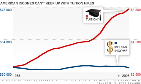
The Supersizing of American Colleges, due to a subsidy-fueled spending spree, the cost of college has increased over the past 30 years faster than the price of healthcare, housing, or just about anything else. Tuitions, student debt, and student loan default rates have all skyrocketed, leading indebted graduates to malign their degrees and pundits to argue that college is not worth the price tag.
In contrast, the research on the financial value of a college degree all concurs: A bachelor’s degree is a sound investment whose value is growing. The extra income graduates earn compared to high school graduates more than compensates for the high cost.
College should not be defined by financial payoff. But all appeals to the value of a liberal arts education or cultivating civic virtue are moot for all but a wealthy minority if a college education is prohibitively expensive.
How do we resolve this paradox that college is a sound financial investment, yet an increasing number of students find themselves unable to pay back their loans? When it comes to educating students and preparing them for careers without indebting them, how do we grade American higher education?
College may still be, on average, a worthwhile investment. But for American higher education, a ‘D’ is still a passing grade.

The Case for College

Judged from a financial perspective, a bachelor’s degree has a positive return on investment thatbeats the returns of the stock market, corporate bonds, and the housing market.
We see this in the above figure, Lifetime College Payoff, which demonstrates the financial payoff of attending 1,511 different American colleges and universities as an undergraduate. The data comes from an analysis by Payscale, a salary data and software company for individuals and businesses.
Payscale draws on its information about alumni salaries. It calculates the expected earnings of a newly minted graduate over a 30 year career by summing the median incomes of alumni from his or her school who graduated between one and 30 years ago. This assumes that a class of 2013 graduate will have a comparable income in 5 years to the current income of someone who graduated (five years ago) in 2008 - an assumption we will address later.
To accurately measure the earnings bump graduates receive thanks to their bachelor’s degree, Payscale takes this expected income of a college graduate over his or her career and subtracts the total income they would have made during that time if they did not attend college. To do so, Payscale subtracts the median wage of a high school graduate over those 30 years as well as over the four years a college graduate spent attending college instead of working. This resulting figure - the earnings bump from attending college - is on the y axis.1
The results reveal patterns in the financial value of degrees. Research universities (both public and private) outperform their non-research peers, which are outperformed in turn by engineering schools. Public institutions, which educate some 70% of the nation’s students, perform as well as many private schools at a lower cost. This data suggests that students at many prominent liberal arts schools pay for more prestigious facilities and faculties - but not better career outcomes. Ivy League graduates pay the most but reap the greatest benefit of all non-engineering schools.
But most students don’t pay the full sticker price of tuition - especially at private schools. When we look at the median net price (the actual amount paid after subtracting for grants and scholarships), the cost gap between public and private schools narrows but persists.2
Differences between individual school’s financial aid policies can change the calculus for low-income students even more dramatically. For example, Princeton, Rensselear Polytechnic Institute, and Notre Dame all offer a 30 year income premium that is 6.5 to 7 times the cost of attendance. But for students whose families make under $30,000 a year, the financial payoff is 73 times the net price of attendance at RPI, 122 times the net price at Notre Dame, and 192 times the net price at Princeton.
Major choice also impacts future earnings just as much as college choice, as does the eventual choice of a career. For example, the median lifetime earnings of an individual working in a STEM (science, technology, engineering, or mathematics) field is $3 million but only $1.2 million for someone in the health support sector.

Best and Worst Median Salaries

Ranked by College Major

RANKMOST LUCRATIVESALARY
1Petroleum Engineering120K
2Pharmacy Pharmaceutical Sci & Admin105K
3Math & Computer Science98K
4Aerospace Engineering87K
5Chemical Engineering86K
6Electrical Engineering85K
7Naval Architecture & Marine Engineering82K
8Mechanical Engineering80K
9Metallurgical Engineering80K
10Mining and Mineral Engineering80K
RANKLEAST LUCRATIVESALARY
1Counseling Psychology29K
2Early Child Education36K
3Theology & Religious Vocations38K
4Human Services & Community Organization39K
5Social Work40K
6Drama & Theater Arts40K
7Studio Arts40K
8Communication Disorders Sciences & Service40K
9Visual & Performing Arts40K
10Health & Medical Prep Programs40K
Despite these variations, the Lifetime College Payoff figure indicates that college is a sound investment. The majority of schools offer a 30 year wage premium of over $200,000, or $6,667 a year in extra income compared to a high school graduate’s salary. Payscale’s analysis also subtracts the cost of college from this payoff to calculate the return on investment (essentially how much money you gained or lost by attending college) and finds only a few outliers with a negative return. And as you can see from their full list of schools here, when you account for net price, the return on investment is impressive.
Of course, most students can’t pay for their education up front. However, if we look at the ratio of graduates’ loan payments compared to their salary, 89% of institutions leave their median, financial aid receiving graduate with a ratio below 10%. This means they spend less than 10% of their salary paying back student debt - the conservative maximum amount recommended by the nonprofitFinAid. And every school in the sample has a median ratio below FinAid’s maximum sustainable debt burden of 15%.
Private schools rank poorly by this metric. However, graduates with higher salaries can more easily endure a higher ratio of debt payments. So private schools’ whose graduates earn higher incomes arguably do just as well for their graduates as public school graduates with a lower debt ratio but also a lower income.
The above figures all rely on salary data from Payscale. This means that individual schools’ data may be swayed by the selection bias of who is and is not reporting salaries to Payscale, or simply a lack of data. (A more detailed discussion of the data’s limitations can be found here.) Unfortunately, the Department of Education does not provide salary information, which makes Payscale’s data the best available.
While the accuracy for individual institutions may be imperfect, other analyses vindicate the macro conclusion that college is a sound investment.
The most common approach is to use data from the US Census and other national surveys that record average incomes by education brackets. Pundits often grouch that the ubiquity of college graduates has rendered a bachelor’s degree meaningless. Drawing from national survey data, however, a paper from the National Bureau of Economic Research (NBER) finds the opposite.
In the early 1980s, the average bachelor’s degree holder earned 45% more per year than the average high school graduate. Even as the number of college graduates steadily increased, that wage premium increased to 70% in the late 1990s and to nearly 80% today. The authors even speculate that the supply of college graduates may be too low.
The story here is that of rising income inequality in the United States: Technology has increaseddemand for skilled labor, rewarding college graduates and hurting those without college experience. So while the value of a college degree is increasing, it should be noted that macroeconomic forces - not improvements within higher education - are largely responsible.
Further, the average income of bachelor degree holders grew for decades but stagnated over the past 10 years. This means that the growing payoff of earning a degree over the last decade is a result of the collapse of unskilled laborers’ wages. This makes college grads relatively better off, but it is hardly a rousing defense of the value of college.
Among today’s young graduates, 50% are either unemployed or working jobs that don’t require a degree. Despite the bum deal of graduating during a recession, however, young graduates in 2010 still enjoyed an unemployment rate 9.3% lower lower than their peers who had only a high school degree.
Working off national level data similar to that used by NBER, The Hamilton Project finds that the wage premium even of young graduates has grown over time - from $4,000 a year (adjusted for inflation) in the 1980s to $12,000 today.
The financial logic of investing in college seems so clear that economist James Monks nonchalantlywrites in the midst of the student loan crisis:
 How difficult will it be to pay back one’s student loans? A total of $20,000 in student loans would require a payment of approximately $250 per month for 10 years. Some personal financial planners suggest that student loans should not exceed 10 to 15 percent of one’s gross earnings. Under this rule, an annual salary of between $20,000 to $30,000 would be sufficient to pay off the loan without due hardship.
College skeptics might counter that a college degree seems worth it only because smart, high-achieving people all go to college. Or that college’s true value is the expensive piece of paper that signals intelligence and motivation to employers.
These are important points. But the available evidence does suggest that while both critiques have teeth, they account for only part of the increased earnings of college graduates. A recent Washington Post article covers some of the studies - from comparisons of twins of different education levels to investigations of the increased earnings of those who attend college without graduating - that suggest a college education itself leads to increased earnings.
The student loan crisis, however, is not a myth. As we covered in last week’s post, both debt burdens and delinquency rates have increased steadily over the past decade.
So why do so many students fail to reap the benefits of what seems to be such a sound investment?

Four theories of student loan defaults

Before we discuss what could be driving high default rates, we should note what is not responsible.
Entitled Millennials pursuing useless liberal arts majors and expecting a plush job to reward their knowledge of Plato and Pointillism does not account for the debt crisis. As of 2008, the average undergraduate worked 30 hours a week. Undergraduates also focus intensely on preparing for the job market. Nearly half study business, economics, or a STEM major. The rest mob programs linked to jobs, like law school and nursing programs. Only 12% study the humanities - and usually find careers, as they always have, in business, law, and the many fields that demand writing or artistic skills.
But the grouching is half right. In Academically Adrift, two sociologists find that class and study time at colleges has dwindled well below 40 hours a week and that 36% of students gain no critical thinking skills during college. But this is as much a reflection of higher education’s failings as the students’. Teaching time is down and grade inflation up. Students are only half responsible for this bargain of “you pretend to learn, and we’ll pretend to teach you.”
Nor can we ascribe the student loan crisis to a temporary result of the recession. It certainly contributed. More students decided to ride out the recession in college and state budget crises resulted in reduced subsidies to public colleges. But the trends of increased college spending, tuitions, debt, and default all pre-date the recession.
The first possible explanation for the paradox of high payoffs to college co-existing with high default rates is the backward looking bias of analyses of college’s financial value. The Payscale analysis, for example, assumes that today’s graduates will experience as great a payoff to college 30 years from now as a graduate 30 years into his or her career does today.
That’s an understandable assumption, and one reflected in analyses based on census data as well. So far, the returns for young graduates still seem high. But if the returns to college decrease in the future, this assumption will be a mirage. In the 1970s, research suggested that college was a losing proposition economically. But college students who ignored that advice benefitted as the college wage premium rose over the course of their careers. We could face the opposite situation in the future.
A second theory is that while college is worth it on average, rising costs mean that college is no longer worth it for an increasing number of students for whom the returns of attending college were already close to zero. And for every student, as debt burdens go up, the chances of defaulting increase as well.
Since most data is available only in medians and averages, it’s difficult to verify this theory. But some evidence suggests that the returns to college are so high that even these “marginal” students benefit. One recent study compared the earnings of students who just made the academic cutoff to attend the Florida State University System with those of students who fell just below the cutoff (and mostly did not attend college as a result). We might expect college not to be worth it for these students on the margins of qualifying, yet they reaped returns of 11%.
Nevertheless, experts most commonly endorse this explanation of rising student loan default rates.
A third, complementary explanation is the rise of “merit aid.” Financial aid has kept the actual price students pay for college from increasing as dramatically as sticker prices. However, an increasing amount of aid goes to students that don’t need it in the form of merit aid. The percentage of grantsawarded to students in the lowest income percentile dropped from 34% in 1996 to 25% in 2012.
Sometimes merit aid is used to compete for top students, but much of “merit aid” goes toward drawing average students who can pay more tuition. This is especially true at state schools looking to attract nonresident students who will pay higher, out-of-state tuition costs. Either way, the effect is that the net price of college overstates the affordability of college for low income students since so much aid goes towards those that can afford it.
A fourth and final theory is that largely unknown, inexpensive, poorly performing schools are responsible for the lion’s share of defaulting graduates and delinquent debt. The main evidence for this theory is the context of who holds delinquent student debt.
The unemployed law school graduate facing a six figure student loan debt makes headlines. But student debt in default consists primarily of debts of one to several thousand dollars. Its holders are mostly individuals from low-income families who dropped out of college or even failed to complete high school (and took on student debt for a nondegree training programa or to pay for a child’s education). A disproportionate number are Hispanic or African-American.
So while big name schools are behind the spending race driving up tuition prices, the student debt crisis is best understood by looking at little known universities, community colleges, and even training programs. The schools with the highest reported default rates fit this description: their names are recognizable only locally, tuition is only a few thousand dollars, and nearly half of the students receive Pell grants (Federal grants for low-income students) supplemented by loans.
The rise of for-profit universities has likely fueled this. Good data on for-profits is scarce. But we know that for-profits now enroll 10% of all students, up from 3% in 1999, and account for a quarter of Federal aid money.
Not all for-profits deserve scorn, but many have drawn scrutiny for terrible graduation and default rates. The dominant business model is receiving accreditation by buying a non-profit college, aggressively marketing degrees of limited utility (including online accreditation) to low-income students and returning veterans, and then sucking up their Federal student aid money. Half of all student loans at the for-profit Corinthian Colleges fail, although the colleges still get their Federally backed loan payments. The Corinthian Colleges enroll over 100,000 students.

Is there a bubble?

$0k$10k$20k$30k$40k$50k$60k$0k$5k$10k$15k$20k$25k$30k$35k$40k$45kAVG STUDENT DEBTTUITION2011Private collegesPublic colleges
Each dot represents a college or university - hover over dots to see the school name. Mouseover the year to go backward and forward in time. Debt is per student who borrows money.
Over the past 30 years, American education has been supersized. Fueled by Federal subsidies, college spending and tuition prices have risen faster than prices in almost any other sector. Student debt has tripled over the last 7 years alone and default rates skyrocketed. This has led to a flurry of articles, reports, and sound bites that use the most feared words in America: “crisis” and “bubble.”
Student loans, however, seem unlikely to cause a 2008 style collapse of the financial system. As Federal Reserve Chairman Ben Bernanke has noted, student loans don’t threaten the entire financial system because the government is liable for the majority of the debt - not banks. Out of the $1 trillion student loan debt, the Federal government guarantees around $850 billion. Nearly half of the remaining $150 billion is held by Sallie Mae, a previously public institution that performs minimal banking activities.
Nor are the rising prices people pay for college based on irrational optimism or divorced from intrinsic value - the essence of a bubble. (Although usually achieved through trading.) Despite the gloomy pronouncements, the value of a college degree has been increasing over time. The data indicates that it is a sound investment and that there may even be an undersupply of college graduates.

Grading America’s colleges

That does not mean that we should give American higher education a passing grade. Not bringing down the entire financial system is not a high standard. And the high delinquency rate suggests a serious waste of public and private money.
The skills-bias of technology over the past 30 years has been a gift for colleges, making a college degree increasingly valuable. College graduates could have reaped the benefits of increasing returns to college and the necessity of public subsidies could have decreased. Instead, colleges ramped up spending, largely unproductively, necessitating a flood of government subsidies and unnecessary student debt burdens.
The human toll and bad investments represented by the high delinquency rate may represent the actions of certain colleges with particularly poor graduation and default rates. Or colleges’ profligacy may be increasing the risk of default across all institutions and pushing students on the margins of benefitting financially from their education toward negative returns. Either way, high college spending is a drag on the economy. There are already signs that the extra dollars wasted on college prevents graduates from buying new cars and homes or making other investments.
For American colleges, a ‘D’ is still a passing grade. Despite recent disillusionment, Americans need to know that - on average - a college degree is still a very sound investment. But they also should know that - on average - colleges have performed abysmally at providing value to their students.
The fact that college is still a sound investment should not keep us from demanding better of the purveyors of lofty speeches about human progress. Nor blind us to the possibility of challenging the four year degree system.
Advocates of replacing college with massive online open online courses (MOOCs) or experiential learning exemplified by tech incubators often forget the positive externalities of interacting on a campus, especially the support network for students that don’t thrive in self-motivated learning environments. Advocates of skill-based certification programs often forget that skills become outdated (ask a typist who expected to be set for life) and that a successful education cultivates the ability to thrive in any future environment.
But with college costs spiralling ever higher, it would be valuable to figure out where a certification program is more advisable than a degree and how to marry the best aspects of on-campus education with the efficiency of MOOCs or other models. Education is more valuable than ever, but that’s no excuse to ignore cost concerns.
College may seem at a glance to be too much of a four year party. But don’t simply blame the students. For an increasing number of them, it’s a party that masks their own trepidation or that they try to skip. Because after graduation, the party continues for the colleges themselves. Only the graduates endure the long hangover, and, between the graduates’ debt and taxpayer subsidies, we all foot the bill.

Follow vam_27 on Twitter